POST
Creating Infographics is Hard - some beginner hints and lessons learned
Author: Alan Richardson
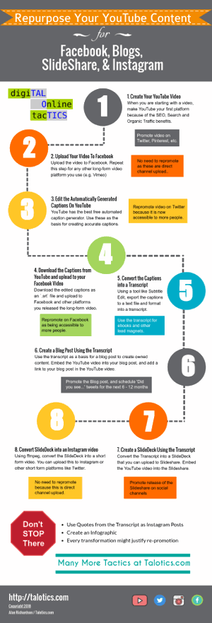
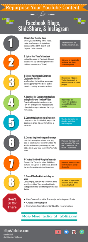
I created an Infographic on how to repurpose YouTube content into blogs, facebook, slideshare and other channels. And I thought it was OK. But I also took a second stab at it and I think the second version is better. Here’s what I learned from the changes.
The Infographics
The following are links to the Infographics on Visme:
| First Version | Second Version | |
|---|---|---|
 |
 |
Just in case you can’t tell the changes I made were:
- Drop Shadow on the number
- The ‘repurpose’ hint boxes are all the same width
- A single column of information rather than a snake
- Some Logos at the top of the header
Thoughts
- I prefer the second one
- I wish the second one had a bit more complexity, but as a first Infographic I think it is fine
- I would like to have kept the ‘snake’ flow, but I would add that as a next version change
Lessons Learned
- Write your Infographic content as bullets and paragraphs in a text editor prior to creating the graphic
- Use simple shapes to start with
- Make your boxes and paragraphs the same, and then resize them later if necessary
- Edit the text to be shorter in preference to changing the size of the container shapes
- Start with the simplest format of your Infographic, add complexity later
- Maintain a consistent colour palette
- Group shapes together to make them easier to re-organize
- Drop shadow helps make large numbers and words easier to read
I used Visme.co to create these Infographics.
Do you have any secret resources or tips you use to create Infographics?